Color is special because it is a malleable thing, and there is no way to pin it down. Color evokes a mood, a time and can change, or stay the same—making it in a way, kind of alive. We see color all around us in a super-saturated way that makes us aware of even little changes, and so when a retail store design gets its color right—there is a kind of energetic frequency that pairs up with the visible products in the space, speaking volumes to customers about your brand.
90/90 Rule
It is commonly known in the industry that potential customers make a subconscious judgment about a brand within 90 seconds of entering a store, and 90% of first impressions are based on color. Quite simply, use the right colors in your retail store design because it makes a big difference.
What is the right color scheme for your products?
Let’s look at how individual colors can create an instant response in retail customers, and how you can harness this to drive business. Research has shown that red grabs attention because it catches the eyes and effectively says, “Look at me!”. Red is great for sales because it reduces analytical thinking, and that inspires more impulse buying. Orange and pink both evoke happiness, while orange is also the color of energy and enthusiasm, and impulse buyers also respond well to this color.
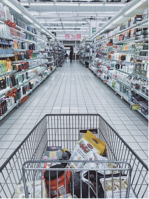
White, especially tuned to lower color temperature (measured in Kelvins), plays a very major role in retail store design by making product packaging appear vibrant and encouraging dwell time in a store. Customers and employees alike psychologically prefer warm white light. In the example below, a warm white of around 3,000K is used to achieve this, as is common in supermarket settings.
Color temperature is important because over the course of a working day, the lighting in your retail store will surely change, and so the need for color-tuning techniques becomes important. Different color temperatures will also make different products look their best. For example, under cool light, fruit like apples will look greyish, but very appetizing under warm light with more red in it (5,000K). In a jewelry store, diamonds and gems will sparkle much more under very cool light of 6,000-7,000K.
Layering Colored Light
Retail store design lighting should also provide color intensity options that are layered. Techniques for layering colored light will develop depth and contrast within a retail space that will be much more versatile. It requires choosing appropriate lighting fixtures for their specific qualities, while also enabling the flexibility to adjust them. After all, some of your retail displays are dynamic and seasonally change, so the way you light them should be too.
A balancing act is clearly the best approach—as in the example, with different ambient levels of light contrasted across the space in different areas, but overall, providing a uniform whole. The shifts in contrast are very subtle, and they highlight important features, and create an exciting, alluring environments. One that the shopper can immerse themselves in and focus on the merchandise.
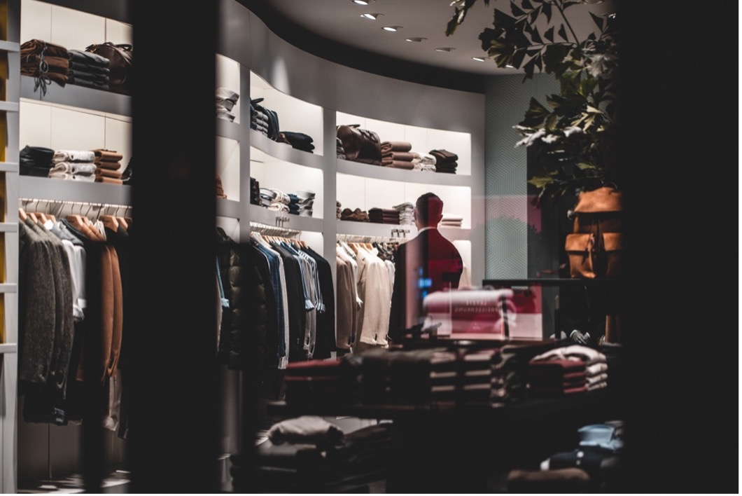
It is better not to make shifts in color contrast too abrupt, or create excessive differences in brightness that force the eye to blink and readapt. This would cause shoppers to become tired, and also make the store seem dull and uninspiring.
Don’t forget to factor in any light that is coming from digital displays and signage, as this will add to the color contribution in your retail store design. Today, retail stores can have a good number of digital displays which cast a fragmented blue light on product displays, and can interrupt the overall mood created by color.
It is possible to introduce too much of one color with light, which takes away from the contrast and drama retailers need to create with color in order to keep a customer’s interest on products. Retail interior designers can provide a wealth of insight here on determining how colored light should be positioned in a space—up, down, backlit, side-lit—this will determine the best lighting products to use in each space.
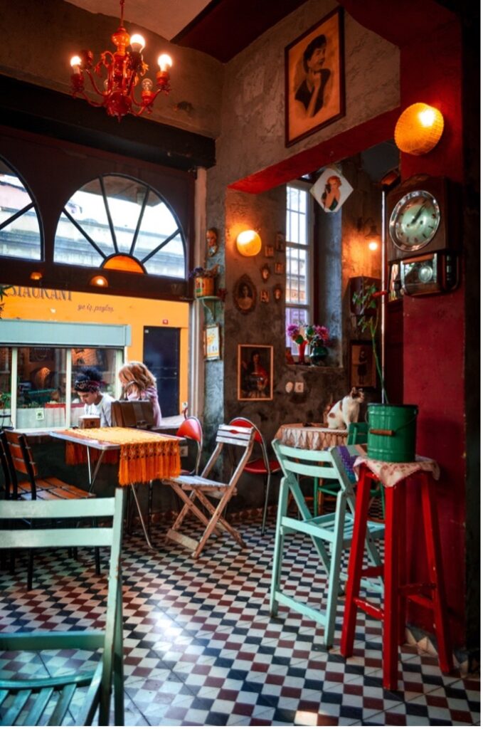
In the example above from the interior of an in-store coffee shop, bright colors mingle with dark tones allowing the space to activate a customer’s senses with the interaction between dark colors that create an illusion of depth. The blurring of boundaries with subtle color combinations, such as green and blue or a blend of magenta and teal, is very effective at achieving a relaxed and optimistic setting.
We hope the above examples have illustrated some aspects to consider as far as color within retail store design. Retailers should do the research to uncover what would best suit their customers, their product and their brand. But definitely try something new, especially if you believe it would suit all three and contribute to a positive impact on sales.