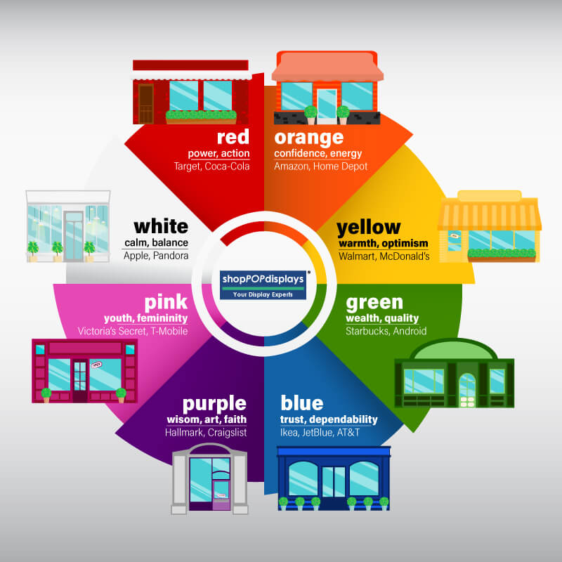
Carefully choosing display elements is an essential step in any visual merchandising project and incorporating the right color for your brand or product can bring your display to the next level. But why not stick to a classic black or transparent scheme? While transparent or black display fixtures are usually a safe bet, research from colorcom.com reveals that 52% of shoppers won’t return to a store based on aesthetics alone. A study by 97thfloor.com shows that color advertisements engage customers 42% more than black and white.
If you haven’t used color in your displays before, don’t be nervous! This guide will help you decide which colors can psychologically promote and sell your products and services.
The Color Psychology of Red
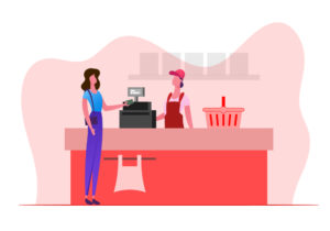
Red is the most powerful color. It is widely believed that red can trigger intense emotion and even provoke immediate action. Red causes the heart to beat faster, initiating the urge to make a decision or a purchase. Red is often used in advertising through a Call to Action.
Target, a US-based retailer, is a perfect example of how to capitalize on the psychology of red. Target is overwhelmingly red – from the registers to the shopping carts to the shelves and bins. Upon entering any Target store, the first thing you see is a wide array of random clearance items that are thrown into red dump bins, preying on your psychological need to pilfer through them.
Target’s brand is composed of two colors—red and white. White is a calming offset, which is why it works so well with Target’s blasts of red. Let’s look more closely at the psychological impact of white.
The Color Psychology of White
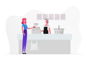
White is very effective as a secondary color in retail because it gives the shopper a sense of balance. White acrylic risers, shelving, and signage are among the most common elements of a retail display.
However, even stores that seem exclusively white, like Apple, need to offset the extreme minimalism with at least one other color. Apple uses light wood tables and counters as a contrasting element. The shade of wood is so light that it is still considered neutral but colorful enough to keep the white walls, floors, columns, and products from appearing entirely monochromatic.
Yellow’s Color Psychology
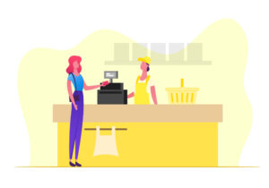
There is no color that comes close to the warmth and optimism of yellow. It works very well on signage, giving passers-by a sincere welcome into your store. Yellow is not as actionable as red advertisements designed for impulse purchasing, but it does effectively draw attention.
Stores that have a strong brand personality, such as Walmart and Best Buy, make use of their yellow branding by incorporating it into floor displays, signage and fixtures. As a brand color, yellow also works well for food and restaurants (Denny’s and McDonald’s).
Orange’s Color Psychology
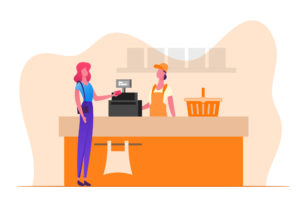
Orange is both a visual and psychological combination of yellow and red. Orange is enthusiastic and cheerful as well as confident and energetic. Orange encourages energy and productivity, which is why you can find them in logos like Nike and the Home Depot. Additionally, orange can evoke feelings of happiness and confidence, which is why you see a big orange smile printed on Amazon’s logo.
The Color Psychology of Green
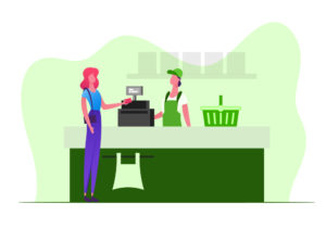
Green is known to represent environmentally friendly brands and products and is certainly effective for presenting a natural or recycled product when constructing your retail display. Certain shades of green can take on a more cognitive meaning. For example, darker greens can convey high quality and affluence. In 1992, former Starbucks CEO Howard Shultz redesigned the iconic siren logo, changing the color from brown to a deep green. When asked why he decided to evolve the brand, he simply stated that the green color was “more affirming.”
Blue’s Color Psychology
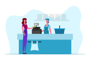
Blue sends a message of strength and dependability, which is why you will find it in many airline brands, as well as technology, hardware, and furniture stores. Blue makes people feel like they are purchasing a trustworthy product or service.
Although the enormous blue and yellow buildings can be initially intimidating, Ikea’s welcoming and comfortable atmosphere gives patrons a relaxed and productive mindset. Their signage and displays, while bright and noticeable, don’t command you to buy; they gently encourage your consideration.
The Color Psychology of Purple

The most unique color in this list is purple. Purple represents wisdom and imagination, as well as faith and artistry. You will find purple in brand logos such as Hallmark, Craigslist and Yahoo. Each of those brands promises a distinctly individual experience. Note that purple should be used in small amounts unless your store or service is intrinsically offbeat.
Pink’s Color Psychology
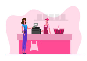
While pink is often associated with femininity, that is not necessarily the only benefit of incorporating it into your display. Brands such as Barbie and Victoria’s Secret PINK capitalize on the estrogen of pink, but technology brands such as T-Mobile and LG use pink as a whimsical and lively asset to their branding. Pink denotes youth, which can be an invaluable tool in displaying food—especially food that might not be classified as particularly healthy, such as Taco Bell, Baskin Robbins, and Dunkin’ Donuts.
Final Thoughts
What are retail displays ultimately for? They are built to sell products. 85% of shoppers place color as a primary reason for why they buy a product, so choose a color that matches not only your brand but the packaging and presentation of your product as well. If you are promoting a new green bottle of shampoo, try using a white pedestal to showcase the product’s cleansing qualities. Insurance sales teams could keep a stack of business cards in a blue-accented acrylic cube cardholder to remind their customers that their company’s services are dependable and trustworthy. Every product and service has a message and a purpose, and it is vital to deliver that message with the psychology of color in mind.
After deciding on the best color scheme for your visual merchandising strategy, it’s time to pick the best retail displays to carry out your vision. Take a look at our extensive selection of retail displays, available in a spectrum of colors. If you have questions about custom displays or coloration, contact us today.

